
Lux branding
LUX Design Ltd - logo, identity, brand
The creative brief
It was important that the creative approach reflected the overall style of Lux Design, but without overpowering the interiors solutions themselves. The client requested a clean fresh look that could be flexible in it's application. Although the type of customers being targeted would be looking for affordable interiors solutions, it was going to be important to include an element of luxury in order to promote the correct impression.
As well as the logo, we were asked to consider colour palettes, typography, image styles and the use of pattern.


The presentation
Once the designers had worked on conceptual ideas, the team presented the client with a variety of options that would meet the brief. This gave the client the opportunity to explore different solutions, and hone those all important criteria for the final outcome. In this particular instance we explored the use of different graphical approaches, coupled with iconography and a selection of typefaces.


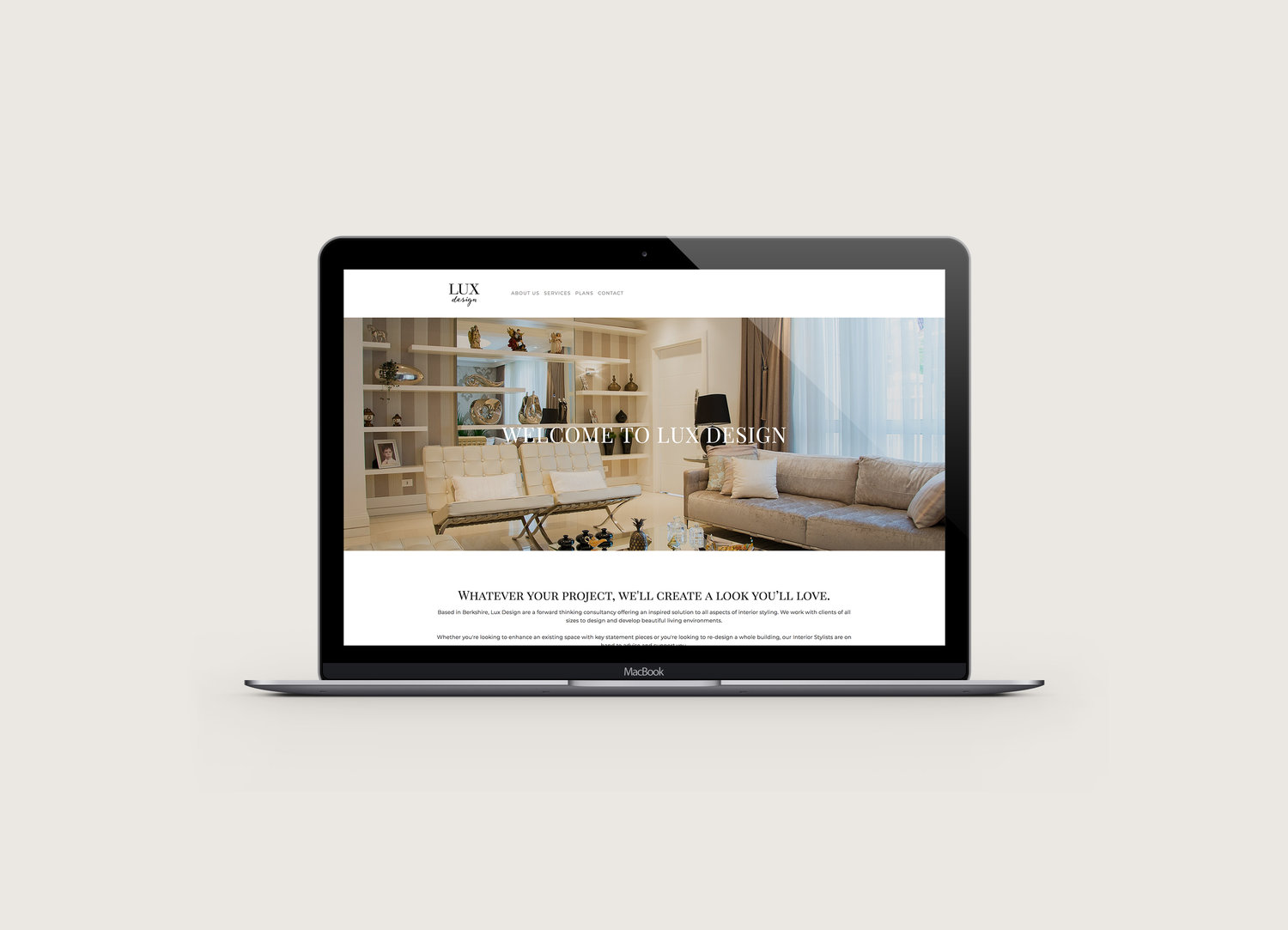
The final design
The client was so happy with everything we produced in our first presentation, it was difficult for them to pick a winner! In the end, for the logo, a classic refined serif font paired with a much more handwritten typeface was chosen to convey a sense of both class and the more personal touch.
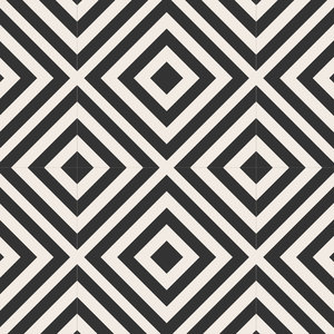
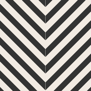
The brand style was brought to life through the use geometric patterns and a subtle colour palette of warm beige's, browns and soft pinks.
Everything created was wrapped up into a style guide so that the brand can be executed with accuracy going forward by anyone who works with it. The guide, much like a set of rules, includes information such as parameters for logo usage, colour breakdowns & image direction.