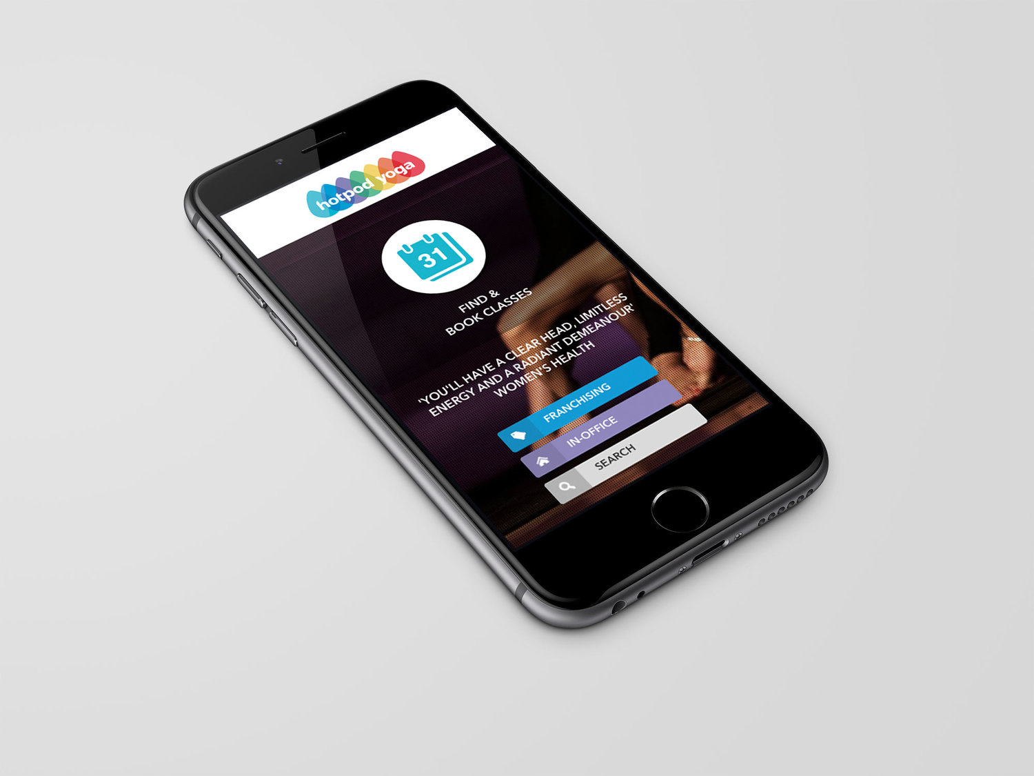

Hotpod Yoga branding & website
Hotpod Yoga - identity & branding
Hotpod Yoga approached us as an innovative start-up in the health and fitness space. Their goal was to provide hot yoga sessions in pop-up, inflatable heated studios, or 'pods' bought to the market within large offices.
Our brief from them was to provide them with a logo which they could naturally develop into a strong brand over time. Their primary applications for the logo included their website, yoga mats, their pods, print and digital marketing materials, water bottles, towels, and company stationery.
Disciplines: Branding / Web design
The Seven Chakras
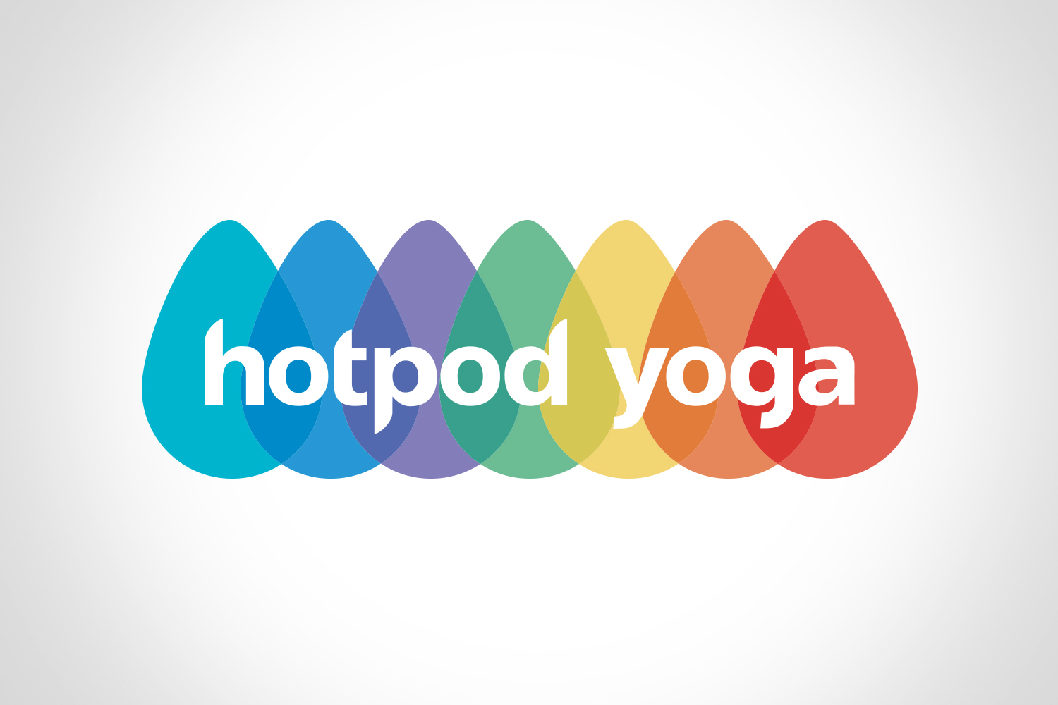
When looking into the fundamentals of yoga, it became important for us to visually represent the seven chakras to help convey the spiritual element of the brand. The idea of representing the chakras had potential to work well as a logo mark, one that could be expanded to use the individual shapes across different brand materials.
The use of soft, organic, pebble like shapes was explored, and it was clear that this was a direction that could work very well for Hotpod Yoga.
When the shape had been decided, we also looked to the seven chakras to inspire the colour pallet. The colour pallet formed a vibrant, young feel to the company, which is something it's owners, Nick and Max wanted to do from the start.

Visual representations of the seven chakras.
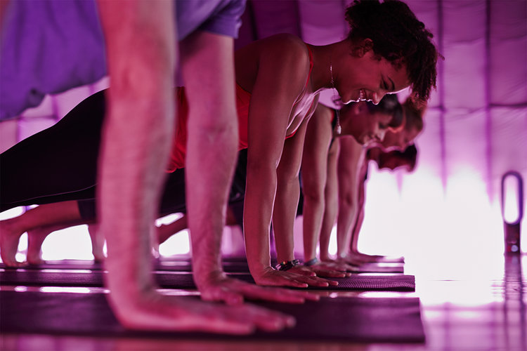
Hotpod Yoga In Action
Hotpod Yoga selected a logo which they felt would work well across all of their brand materials, with the vibrant colours giving them an instantly recognisable look. They had a custom pod designed, with the pod opening influenced by the shape and colour used in the logo.

The custom yoga pod.

It was great to see how effective the logo was when applied to different branded materials.
Ranging from towels to vehicle livery, the logo helped give Hotpod Yoga a strong visual presence in the world of yoga.

Hotpod Yoga towels.
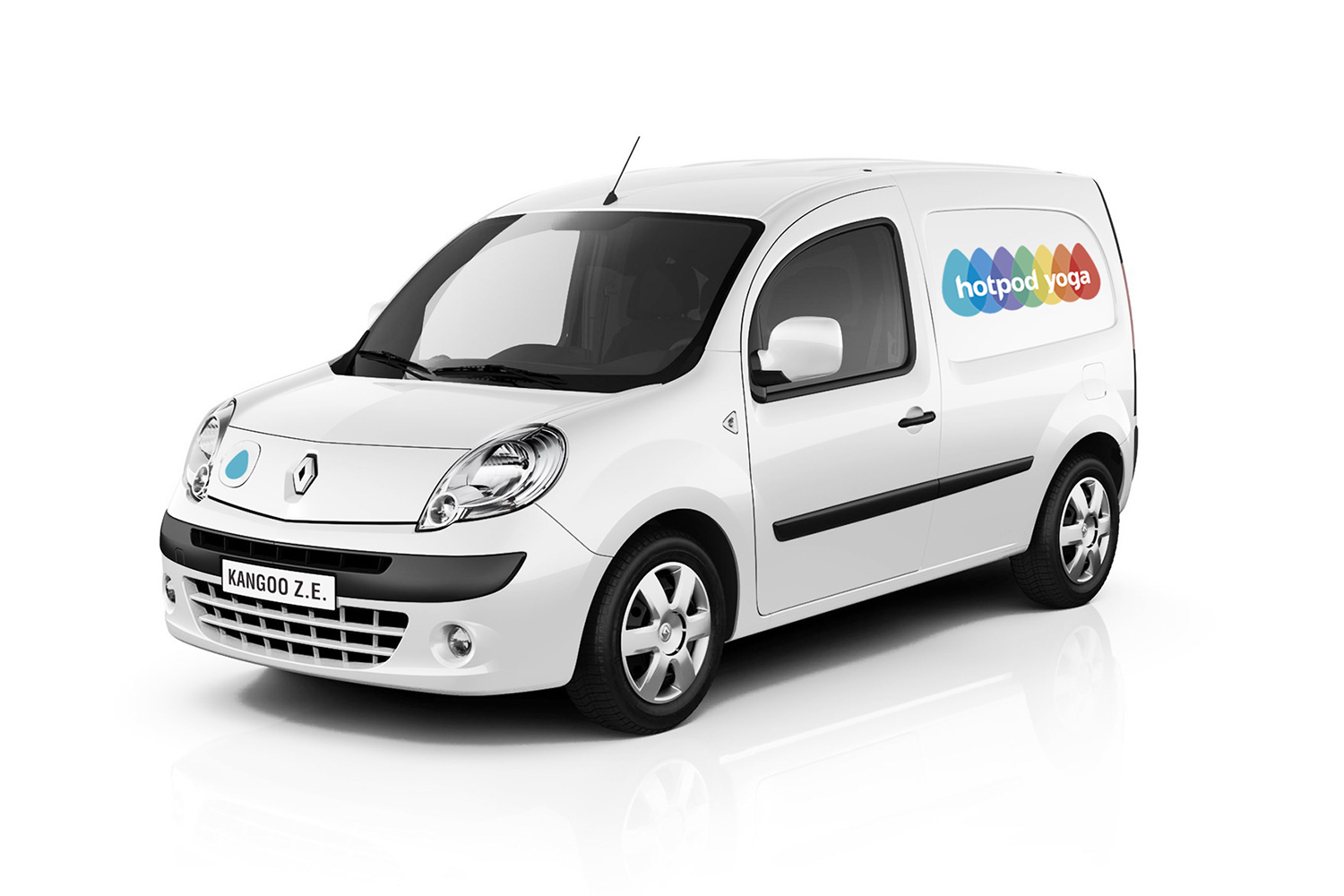
Hotpod Yoga livery.