Planet brand guidelines
The logo
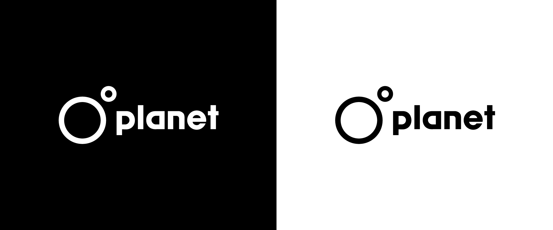
The Planet logo should be clearly used on all literature, and it is an essential element for all forms of brand communications. The logos form or proportions should never be altered, skewed or occluded. The logo can be used in black or white. However the colours used must create sufficient contrast so that the logo is clearly visible.
Logo usage
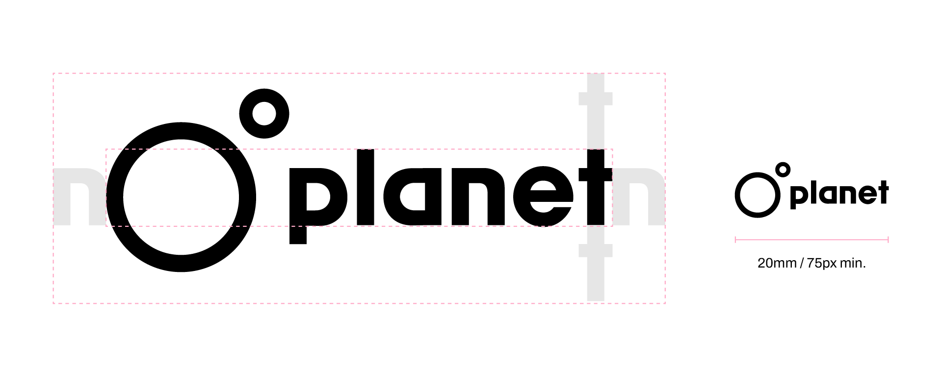
The Planet logo should always be surrounded by a minimum area of space. In order to ensure maximum brand clarity no other elements such as headlines or other logos should encroach on this space. The minimum size for the Planet logo is 20mm wide or 75 pixels for digital applications. There is no maximum size.
Colours
These are Planets primary brand colours. They should be combined in order to create effective compositions with contrast and balance. Please bear in mind issues of legibility when using the colours for typography.

Yellow
Hex: #F0FE54
RGB: 240, 254, 84
CMYK: -
Green
Hex: #6FFFA8
RGB: 111, 255, 168
CMYK: -
Pink
Hex: #FFAAC7
RGB: 255, 170, 199
CMYK: -
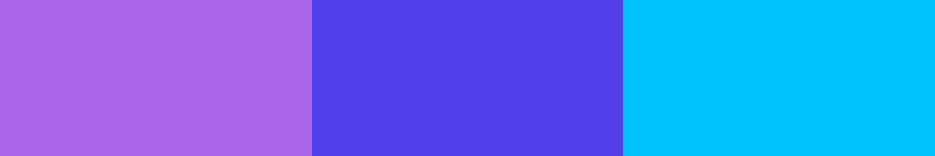
Purple
Hex: #AA65EB
RGB: 170, 101, 235
CMYK: -
Blue
Hex: #523EE8
RGB: 82, 62, 232
CMYK: -
Cyan
Hex: #00C0FA
RGB: 0, 192, 250
CMYK: -
Black
Hex: #000
RGB: 0, 0, 0
CMYK: 10 10 10 95
Deep grey
Hex: #302D30
RGB: 48, 45, 48
CMYK: 0 0 0 75
Mid grey
Hex: #7C7C7C
RGB: 124, 124, 124
CMYK: 0 0 0 50

Grey
Hex: #C8C7C8
RGB: 200, 199, 200
CMYK: 0 0 0 25
Pale grey
Hex: #EBEBEB
RGB: 235, 235, 235
CMYK: 0 0 0 15
White
Hex: #FFFFFF
RGB: 255, 255, 255
CMYK: 0 0 0 0
Typography
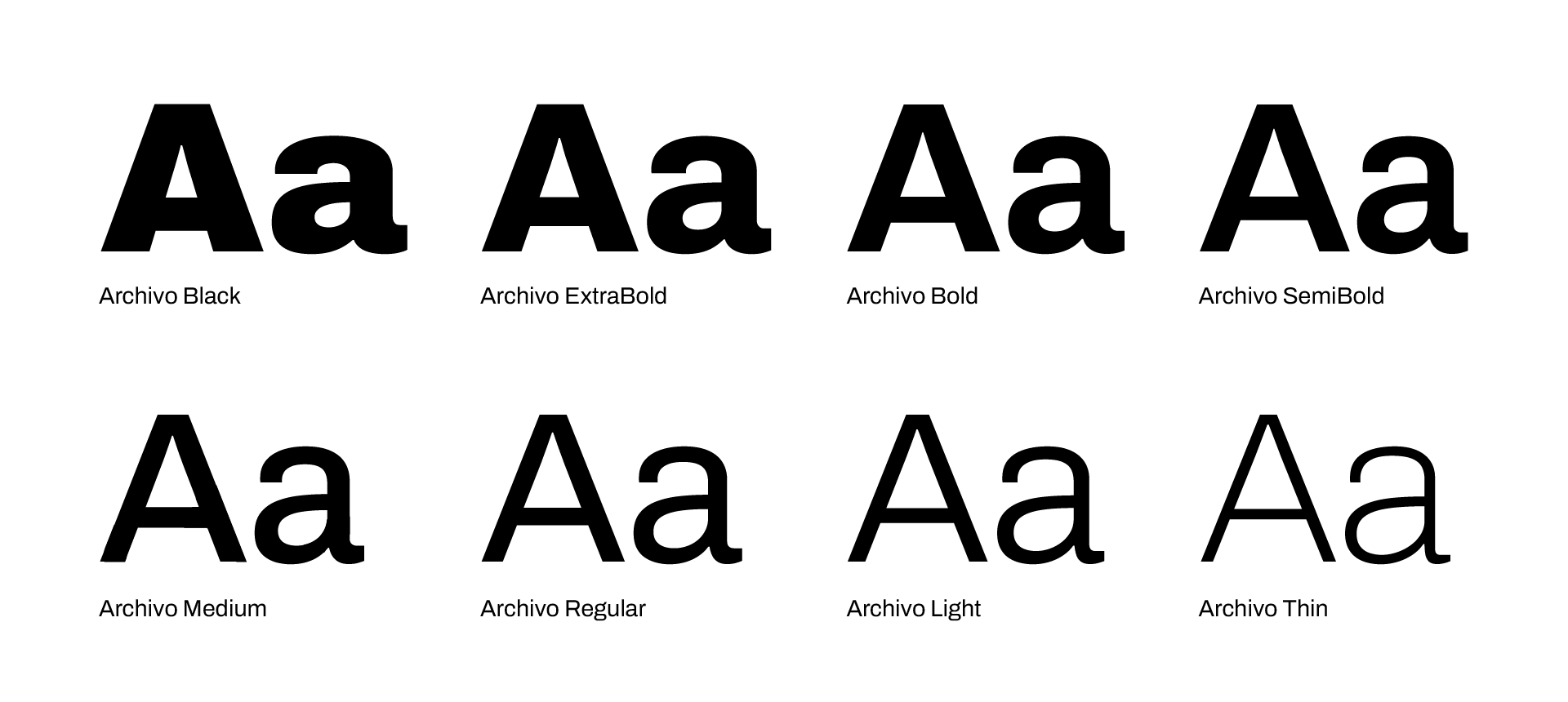
Archivo is Planets brand font, it is modern sans serif font which is available online from Google fonts. Archivo has wide range of weights which allows for a great deal of design flexibility, however it is advised to restrict yourself to using only 3 weights per design piece to maintain clear hierarchy and avoid visual clutter.
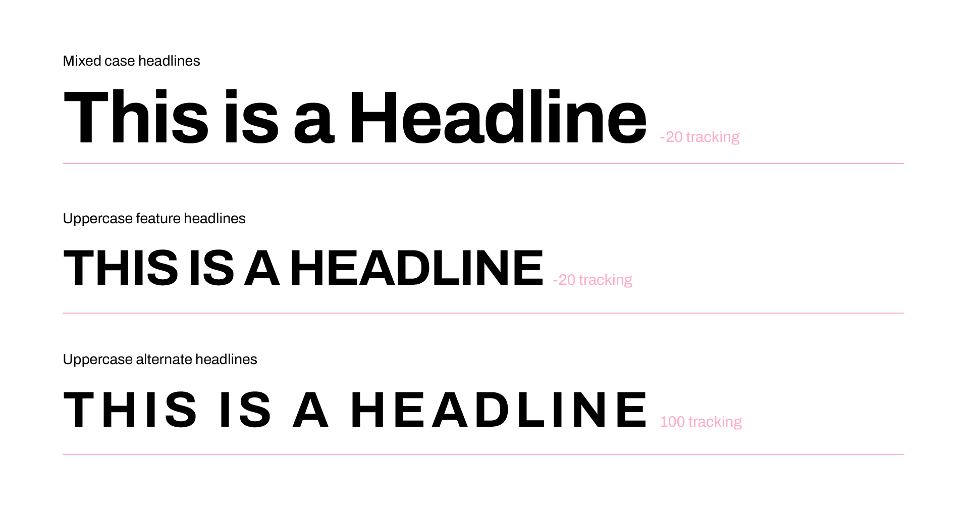
For mixed case headlines reduce letter spacing for a more condensed look. For headlines in uppercase letter spacing can be contracted or greatly increased for visual impact.
Layout
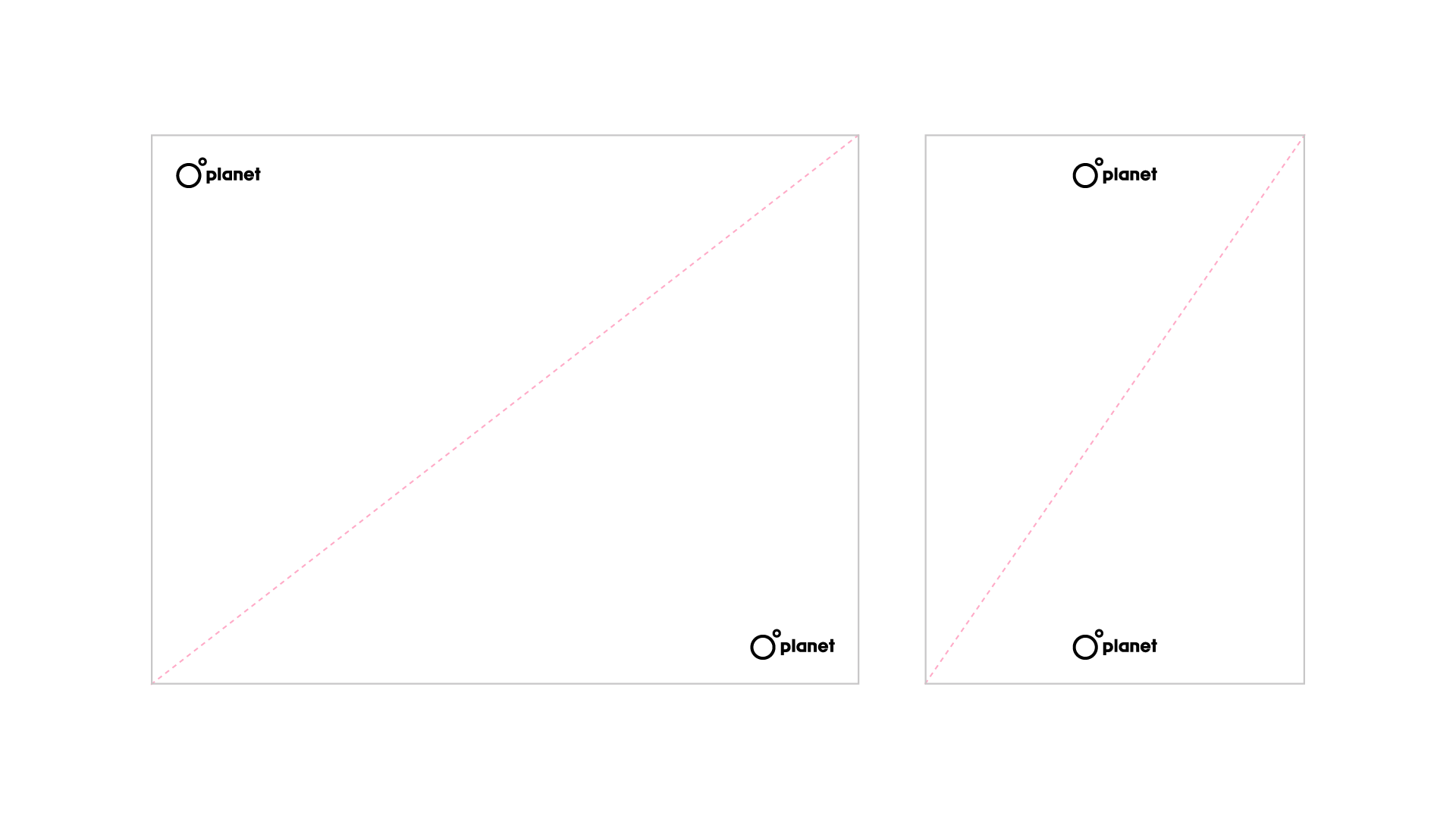
The Planet logo should be positioned in the top left or bottom right corner in most layout instances. For portrait or square layouts, the logo can also be positioned in the top centre or bottom centre of the creative.
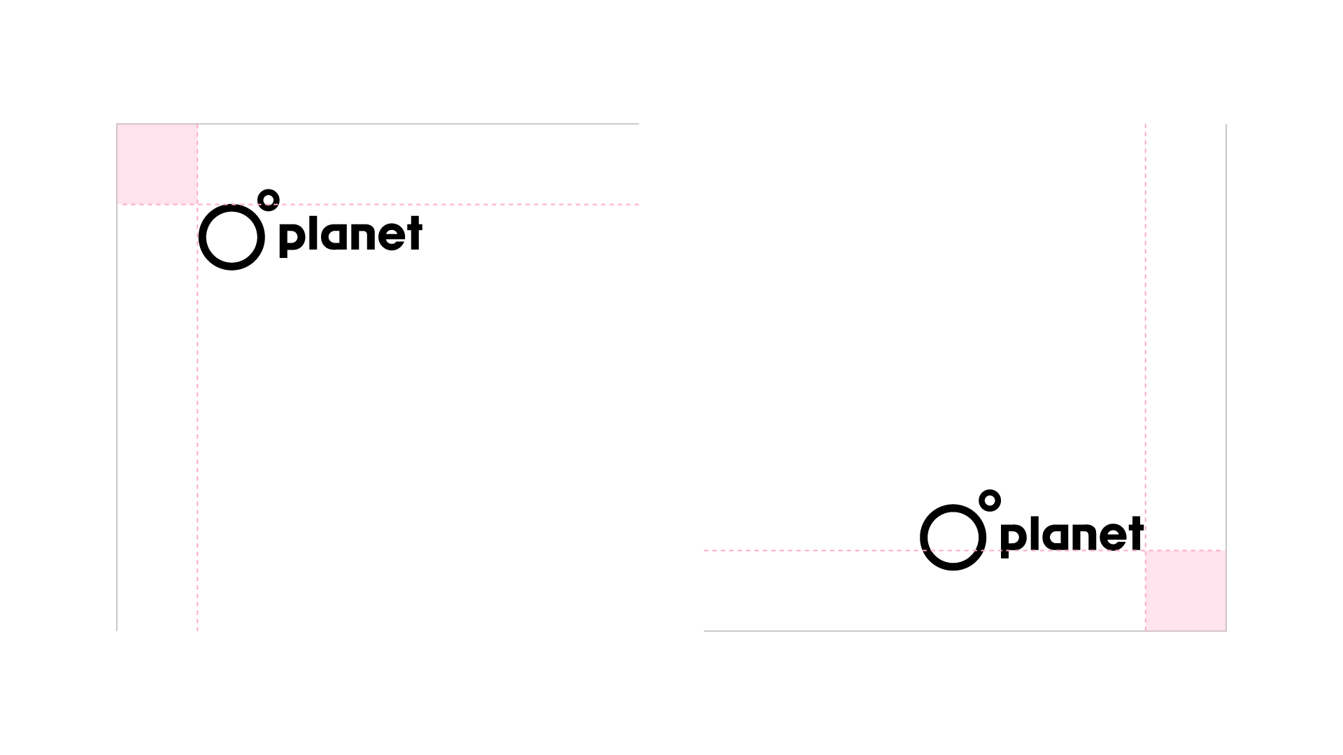
The following rules have been created to optically align the Planet logo. If the Planet logo is positioned in the top right corner, it is advised that you align the logos larger circle to the top margin. For instances where the logo is used in the bottom right corner, it is advised that the logo be aligned to the baseline of the Planet word mark. Please note that layouts do not have to have sqaure margins - this is for example purposes only.
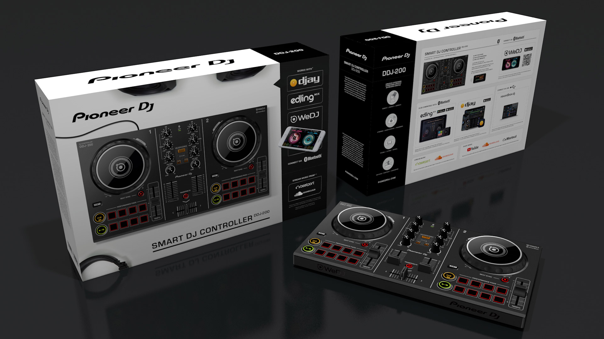
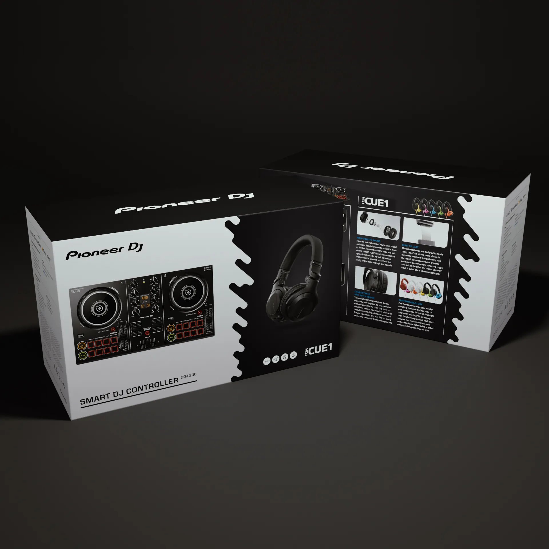
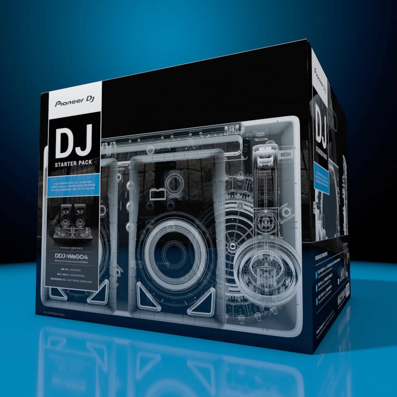
Brand application
To assist in product sales we have created cartons for promotional product bundles and some of Pioneer DJs more mainstream product lines.